The Toasted Odyssey Devlog 4: Chapter 0 and 1 Design
Hello Friends! The Creator has returned for yet another devlog!
Major apologies for the lack of updates and posts here on itch.io. I know I haven't made a devlog in almost 60 days, but I have been very busy lately. I recently made a page for the game on Game Jolt on which there have been a lot more updates on The Toasted Odyssey. I didn't expand to Game Jolt to abandon TTO's place here on itch.io, I made a new system for updates that can provide good benefits for the game. I will post shorter, most frequent updates on Game Jolt while I can do longer and more in-depth talks about the game here on itch.io. Anyways, let's get right to it!
In the last devlog I talked about my thoughts on design and why simplicity can be a good thing if your cards are played right. Design is a very important thing for a game so when I hosted a poll on Game Jolt regarding what aspect of TTO, I was ecstatic when the winner was details about design (To be honest, I'd have felt the same way regardless of the winner. I just love talking about the game!) The posts that followed went over things like the visual differences between Toast and bread, the art style of the areas, and more! Of course I will go over each one in detail directly following this paragraph. So let's get started shall we?
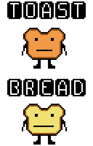
This image details the visual differences between a basic toast character and a basic bread character
Fun fact about this image here: This image was originally supposed to contain designs for both male and female designs, but I had a bit of trouble coming up with the designs for females. An obvious option would be to just slap a bow and some lipstick on them and call it a day Ms. Pac Man style but not only would it feel lazy to me but there just wouldn't be enough detail to establish a difference between the multiple female toast characters, important and unimportant. In this image I tried out a lot of different designs for both genders and I eventually hit that sweet spot for the males but the females just never managed to sit right with me. Therefore, I decided to pick a middle ground and put a featureless, non-specific blank template-like design for this image. I will figure everything out on the gender side of things eventually since toast characters won't be appearing in chapter 0 but the biggest thing about it is that I was able to decide on a definitive shape and size for them. I had struggled a bit in the very beginning on the consistency side of things as you might have seen in the concept art on the main page for this game, but now that that has been decided, it should be easier to design male toast and bread characters from this point on. However, I am still hard at work on female designs and I think I'm getting closer. Next thing about this image is the obvious elephant in the room. They almost look entirely the same. Of course, I'm glad you noticed that especially considering that that is the point. The differences between toast and characters will be very minimal due to the fact that they are essentially the same, but neither side is willing to admit this.
This brings me to the second design topic. There is no image to accompany it because this information is regarding the overall game from chapter 1 and on (which has not been started yet so there is no real way for me to show an example of it at this time.) Each major area (e.g. The Toasted Territory, No-Man's Land, etc.) will be accompanied with a different visual style. For some areas, the difference might be slight but the intention should be for you to know where a character or item is from just by looking at their visual style. A notable difference is the slight change between Toast and Bread. Toast architecture with be darker and browner in color and the lines are thicker while bread is lighter shades of color and thinner. Also the features on bread is slightly larger on bread than on toast. See for yourself. On the image above you will notice a size difference in the facial features. Obviously there will be more than just that but you'll just have to wait and see what the game has to offer!
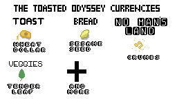
Here is a list of currencies that will be around at the start of the game
As the image suggests, this here is a list of the currencies you can find in the beginning of TTO. While chapter 1 will take place mainly in No-Man's Land, the middle ground that separates most of the territories, you will be able to collect all the currencies listed here. It's always best to start collecting in advance! It is pretty obvious that since every major area has it's own currency, you can't buy items in one area with currency that's meant for the other. But this doesn't necessarily mean that it's better to save up only one type of currency. Some items might be cheaper in one area but more expensive in the other. For example, you might want a specific healing item in The Toasted Territory, but it might be very expensive there so it would be preferable to go to Veggieland where medicinal items are cheaper or more abundant. Of course these all offer a risk reward. Though some items are less expensive in some areas, that doesn't mean that it would be the smartest idea to go to a certain area every time for a specific item. Here's another example. Basic consumable items might be cheapest in No-Man's land but since it is an area of poverty, crime, and depression, you aren't safe even in the cites. You could get mugged anywhere. If you don't feel like you could make the round trip, it would be beneficial to stay home and buy items from the Toasted Territory, which is usually of the highest quality there. Keep in mind that while these ideas will be set up in chapter 1, it won't be implemented completely until the chapters following it, but you should still be able to collect them. The design for the currencies actually took a lot more effort than one would think. From the start, I knew the currency feature would be a thing. But I wanted to make each type of money look like it would make sense in the areas that they can be associated with. The toasts are one of the more advanced species in the game so it makes sense that they would actually have a type of money like people instead of an item. The bread money was a bit more difficult. I originally thought that since bread and toast are offshoots of each other, I should make their currency very similar to the wheat dollar but just a bit more minimal. That's where the idea of the wheat penny (not designed like the old american wheat pennies) came in. It was designed to essentially be a what dollar, but minus the dollar. So essentially just a piece of wheat. That really didn't feel right though. Not just because it didn't even remotely look right, but it didn't really go that well with the environment to just make their currency a worse version of another currency. So the next thing that came in mind was the sesame seed. This made sense. Sesame seeds are always associated with bread and it felt right to design. The crumbs exist more for lore reasons. A common thing that happens to toast and bread (when both are referred as a whole they are called wheatins) after dying a painful death is usually crumbling to bits. No-man's land is brimming with infected creatures known as "The Molded" or "The Perishables" or maybe "The Pathogens". Not sure really what to call them yet. Names are a WIP. Anyways, these infected creatures are running all around in no man's land and are an extreme danger to all life in the world. You can see an example of them in the screenshots on the main page (concept art or not, those designs were probably the easiest to keep consistent since they can take any form that's gross-looking). Most of them follow the same rules as wheatins, where they crumble up upon death most of the time. Crumbs can be harvested from any enemy resembling a wheatin, making crumbs the easiest currency to grind, if you're willing to risk death to get them. There's not much of a story for designing them. I guess it was a bit time consuming to wonder of the dots I was putting on the screen really resembled crumbs, but there's not much to it really. Finally, there's the tender leaf. Not sure why but I really enjoy drawing leaves in pixel art. There's even leaves on the overgrown swords for the logo. Here are some interesting and totally unrelated details in the logo that I think is really cool. While the logo is cool for the sake of being cool, (despite it donning an older toast design in it. Perhaps I'll redesign it eventually.) there is some symbolism in it. I won't explain it right now in fear of accidentally giving out a spoilers for the story, but I'm sure that as the game goes on, it will vaguely make some sort of sense. Getting back on track though, the tender leaf has it's name because it is a leaf that is classified as legal tender. That's really it. Creative right? I have a weird feeling that that wouldn't necessarily make sense to most people unless it's name was explained though I guess it probably is a fragile leaf, giving it an intense double-meaning. Other currencies will become available eventually but for now, those are the only collectible currencies in chapter 1.
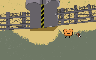
Every chapter will have a secret dog, hidden around the map. Petting them will get you loot.
Ah, this mechanic. The only thing I've talked about that will actually be in chapter 0 as well. This actually leads to a relatively funny story. When first designing this idea, my thoughts was to pet the dog, and have it dig up something random and it would fly off the screen in some far-fetched way, but it didn't necessarily turn out the way I wanted. When I take a stab at a new thing, I like to ask around to get a reaction. If it's positive, I double down on it, if it's negative, I prepare to go back to the drawing board and rework everything. I usually rely on friends, subreddits, or certain discord servers when I get the opinions. And when I designed this concept in the image above, everyone was wondering why the dog was using the bathroom? I've always intended for this game to be a mixture of lots of genres including comedy, but it never once crossed my mind that it looked like the dog was using the bathroom in this gif. Perhaps I was out of it that entire week because I spent quite a bit of time making it and not once did I think it looked like poop and pee, despite the fact that it looks just like that. Even more embarrassing, I somehow forgot that dogs dig with their front paws. Maybe it was the fact that my dog has a habit of kicking back piles of dirt behind him after he uses the bathroom that temporarily rewired my brain the think "Hey! Dogs kick with their back legs!" Silly me to make that mistake. I was quite embarrassed by this considering how it was a very simple mistake that I'm not very used to making. But one guy on reddit's comment really caught my eye and got me thinking. He said "Some of the best features come from happy accidents. I thought the poop loot was hilarious and interesting and I personally would keep it that way instead of making the digging clearer. Do what you are comfortable with though." There were lots of other people saying the same thing and that had my gears turning. I wondered "What was attractive about a dog pooping out money?" Then it hit me. This feature is very random. The game's concept itself is super random. Something silly and random fits the world super well in the eyes of a player with no idea about the game. Which lead me to think about whether or not I should change the way the animation. I decided to pick the middle ground. Since I planned for there to be different dogs in each chapter, I came to the conclusion that it would be pretty cool for each one to have a different animation. And yes, that does mean one will poop out money. Though I came up with a new idea after the fact, I took a nice 14 day long break from game development after the fact so that I didn't have to worry about making a mistake like that again.
That is really all that I've done at the moment for discussing design in TTO. If I decide to do another poll on a different topic, you can find it on Game Jolt, but for now I'll need to really double-down on development to make up for lost time. I'm sure I can still make the mid-to-late summer deadline but in the unlikely scenario where I do end up needing to delay it, it hopefully won't be a very long one. But for now, I'll see you in the next devlog!