The Toasted Odyssey Devlog 2: Concept Art & The Importance of Simplistic Design

Hello Friends! Creator here!
I never really expected to upload another devlog so soon after the first one (though the more you all get to know me, you'll realize that I'm not always the most consistent with my time-frames lol) but when I was setting up the page for my game, The Toasted Odyssey, I felt that it wouldn't give interested viewers a full grasp of what the game is really supposed to be just with the open-ended description and the logo alone. So I got to work and took a series of W.I.P. map designs and concepts from what will be chapter 1 and more or less drew a hud and a few sprites over it. Though for some strange reason, I couldn't get the final sprites (which are a bit more consistent and well-designed on the spritesheets than in the concept art itself) directly into the background without importing it to unity first. Allow me to provide some context for this statement right here. Normally you would think that it would not be a problem to just put it into unity but there are two separate situations that are currently happening that caused me to want to push that all back a bit:
1. I found the spritesheet for the main character to be rather unsatisfying (I had finally settled on a good design for the main character, and all the toast-based characters in fact. So after that was complete, I began designing a spritesheet for the main character to see in advance how I would make it look. However, once I had finished making the spritesheet and I had uploaded it to twitter-where it can still be found if you look hard enough on my twitter page, @commanderqball, I realized that I wasn't a fan of the side walking animation. It looks like if you were looking at a piece of toast from a direct side view and added "arms" and legs to it. It sounded and looked fine at first but thinking about it from a design standpoint, It would be a it difficult to see a thin, 2 or 3 pixel wide dark object moving around on screen, especially in a darker area. It just wouldn't work. Not to mention, the forward-walking animation looked just like how I wanted the side-walking animation to look like. More or less at least).Though the solution to the problem is simple and can be fixed in basically the blink of an eye, I have yet to fix it because I have other things on my plate that are of higher priority. Which bring me to situation #2:
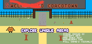
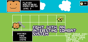
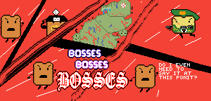
2. The concept art is from what will eventually be chapter 1, however, as I previously mention in my last devlog, I am currently working on the prologue chapter, chapter 0. Now you may be asking: "Creator! If you're working on chapter 0, how come you put concept art for chapter 1 on your game's page? Could that be considered false advertising to advertise aspects of he game that aren't there yet ? And wouldn't it it be better off if you posted screenshots of the chapter you're currently working on instead?" Frankly, those are very good questions. I am fully aware of the fact that the concepts in the art might not show up or look the same as listed on the game's page. However, that really only applies to chapter 0 because the real game doesn't really start until chapter 1. It isn't really all that necessary to play chapter 0. You could play chapter 0 and then the following 7 chapters, you could play chapters 1-7 then play chapter 0, or you could even skip chapter 0 altogether. It's really up to you. Chapter 0's main purpose is to set up the story that chapter 1 starts off with to create a poetic irony of sorts, while also laying out the game's core mechanics and such to the player. So I guess you could consider chapter 0 to be a tutorial or a demo. I plan to add other mechanics in the coming chapters so that each chapter seems fresher than the other in a way that doesn't seemed forced. More on that in the next devlog. So long story short, I added the concept art of chapter 1 to the screenshots section of the game's page because I felt that chapter 0 doesn't fully represent the game itself to it's greatest potential, as its main purpose is to set a foundation. I decided to establish that on the images themselves in a rather quirky way to once again establish, that if you were to download the toasted odyssey right after I uploaded it, you wouldn't find everything shown in the images (the images themselves. the text still does have unique areas, fun characters, boss fights, and an interesting battle system. I'm not going to flat out lie to you about the mechanics themselves) because the game never truly started yet. I thought long and hard about it, but if it gets enough negative feedback, I wouldn't hesitate to find a compromise.
Enough of that rant lol. Let's get on to the next topic. The design and why I deliberately simplified it. Well, I wouldn't say it was 100% deliberate that the art is simple because I am in no way an amazing artist. However, I believe that to get a great game, the art style isn't always the most important aspect. While an amazing or unique art style is a great bonus and an attention-grabber, it most certainly is not a necessity. I'm sure it's a bit cliché when I give this example, but a great example of a good game with a simple art style is a game called "Thomas was Alone". It relied on its puzzles and storytelling to move it along and get this: the characters are simple geometric shapes like rectangles and squares. If that isn't inspiring to an artist that just can't get the art part right, then I don't quite know what is. A few days ago, an acquaintance of mine was struggling to get through an event in a game. I was watching over him while he did so, and when I noticed he was struggling, I told him that he's focusing foo much on countering other players in pvp with too much or too little force and stuff like that. I told him he needs to stop focusing on playing the traditional way and to find his true balance. Eventually he started to improve and I could really see him taking my attempt at advice into account. The reason why I explained this all to you is because I am finding my balance. I feel that I can truly drive my game with proper development and storytelling all with a simplistic art style. Regardless of whether the project is successful or not, I will stand by that opinion. Apologies for the little rant that I went on in today's devlog. The next one should be a bit more productive, where I explain what kind of initial features I want the individual chapters and how I want them to work. Goodbye and thank you for reading this!
The Toasted Odyssey-An Episodic Adventure
| Status | In development |
| Author | The Creator |
| Genre | Adventure |
| Tags | 2D, Action RPG, Episodic |
| Languages | English |
More posts
- Long overdue update and Delay infoAug 05, 2020
- What's up with the Boot Camp Demo?Sep 25, 2019
- The Toasted Odyssey Devlog 4: Chapter 0 and 1 DesignMay 07, 2019
- The Toasted Odyssey Devlog 3: Chapter 0 and 1 DetailsMar 04, 2019
- The Toasted Odyssey Devlog 1: Meet the Dev!Feb 25, 2019
Leave a comment
Log in with itch.io to leave a comment.